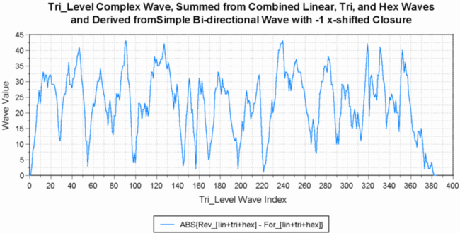
With equation [76] and [77], and the graph in Fig. 11, we have completed this formalized development of the TWZ data set. We are now in a position to compare these results with those of the standard development reported by McKenna and Meyer in the Invisible Landscape and the TimeExplorer manual, as well as address the issues raised by the Watkins Objection.
Fig. 12 is a graph of both the standard and revised data sets, and it shows some remarkable similarities as well as significant differences. One interesting feature of this graph, is the nature of each wave at its respective endpoints. Recall that the value of the wave at x = 0 will be discarded because it is a duplicate or "wrap" of the value at x = 384. This will not effect the relative values of the two waves at x = 384, because they are both zero-valued at this endpoint. However, the value of each wave at x = 1 is not the same, with the standard wave having a value of 10 while the revised wave value is zero.

Why does this matter, you may ask, since there are many obvious differences between the two waves - what is the significance of this difference? For the standard wave, it has been argued that the zero value at the end of the waveform implies some kind of singularity at the end of the process - or at the end of time. This revised wave is implying, that there may be singularities at both ends of the continuum. This is also an argument for a closed system that may be undergoing some kind of cyclic renewal process - perhaps each cycle expressing ever higher ordered states of complex form, or Novelty.
There are concepts emerging from the field of quantum cosmology that may describe an analogous cyclic process. This is a theory in which universes are treated like quantum particles that inhabit a larger, or higher dimensional domain called a multiverse. Michio Kaku [12] , a theoretical physicist and co-founder of string field theory, has described a process where universes emerge from the zero-point, or vacuum field, go through an evolutionary process, then perhaps return to the zero-point field at the end of the cycle. This cycle may then repeat itself, possibly with increased complexity and Novelty. Could this be similar to the process that the TimeWave and Novelty Theory attempt to reveal? Perhaps further investigation into the nature of the TimeWave will shed some light on these questions.
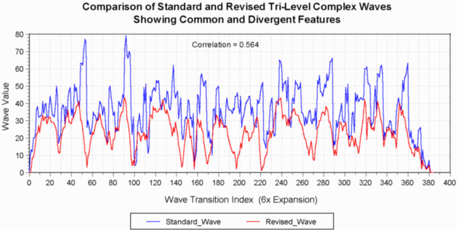
Another significant feature of Fig. 12 is the apparent agreement of the two waves in the lower frequency domain. Frequency content of any waveform expresses itself as variations in the rate of change of its value as the wave propagates in some realm, that could be either a space or time domain, or both. So the slope of a waveform at any given point, or its general shape, can reveal frequency content (the magnitude and rate of specific underlying processes). Examination of the wave pair in Fig. 12 shows that there is a common lower frequency process occurring for each waveform. The higher frequency processes appear as relatively shorter duration peaks riding upon the slower process. The lowest frequency process occurring in these waveforms can be seen by drawing an imaginary line between the highest of all the peaks as one moves over the domain of the waveforms. Slightly higher frequency components can be seen by drawing that imaginary line over the peaks and valleys upon which the sharpest and shortest duration peaks ride. The graphs do differ in the higher frequency domain as can be seen by the steeper slopes of the largest standard wave transitions. This could very well be due to high frequency noise present in the standard data set because of the imbedded mathematical errors.
The low frequency, or long duration processes, are those that may occur on the scale of millennia or even billions of years, whereas the higher frequency processes may occur on the scale of a human lifetime. Could it be that the lowest frequency process is the signature of some creative principle at work, be it strange attractor, zero-point field, or eschaton. Could this creative energy be perturbing the fabric of space-time in such a way as to trigger the creation and conservation of higher ordered states - something like the gravitational energy of a passing nearby star triggering the formation of a comets from the Ort cloud? Is this lowest frequency process then a kind of ground state, upon which all higher frequency processes express themselves? Perhaps in time these questions will be answerable, although certainly not today.
An obvious feature of Fig. 12 that clearly shows in this graph, is the difference in the average wave value between standard and revised waves. The average wave value for the standard wave is somewhat greater than the average value of the revised wave. This difference in average wave value appears to be the result of differences in the higher frequency components of the wave pair, perhaps due to noise in the standard wave that is produced by the mathematical errors that are present. These high frequency components of the standard wave show up as the steep peaks that rise well above the peaks in the revised wave. In the Fourier analysis that follows, these large peaks appear as high frequency noise that adds randomness to the wave. The impact of this difference on the final TimeWave, is to shift the average level of novelty upward (lower values) from that expressed by the standard wave. In other words, the revised wave expresses a process with somewhat higher levels of novelty, than does the standard wave. Since Novelty isn't a calibrated process, it's not possible to determine what the more "reasonable" level of Novelty would be. All that can be expressed then, is relative Novelty.
One final feature of Fig. 12 that requires some discussion, is the correlation number at the top of the graph. In order to determine and quantify the degree of interdependence, or inter-relatedness of the standard and revised waveforms, a mathematical operation called correlation was performed with these two number sets. The number at the top of the graph is the result of that analysis - a value of 0.564. A correlation of 1.0 would mean that the waveforms are identical, whereas a correlation of zero would indicate no functional relationship between the two. Additionally, a correlation of -1 would indicate that the waveforms were mirror images of one another - a peak reflected by a trough etc. In this case a correlation of 0.564 indicates that these two waveforms show a significant level of interdependence, although far from identical. This level of correlation could be considered likely for two number sets that share a common origin, as well as sharing many of the same developmental procedures.
Data Wave and Random Number
Set Comparisons
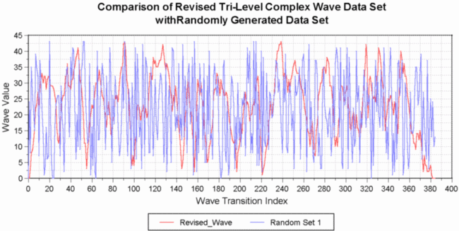
One method for assessing the information carrying potential of the Data Wave, and convincing oneself that it is not a random process, is to compare it with a data set that has been randomly generated. Several such random wave sets were consequently produced to be compared with the revised and standard Data Wave number sets directly, and to also use as input to the TWZ software to generate random seeded TimeWaves. Fig. 13 is a graph of the revised Data Wave with a random wave set overlay, and it clearly shows that these number sets bear little resemblance to one another. Correlation analysis of the two sets shows a correlation of 0.03, or essentially un-correlated as one would expect for any random number set. Fig. 13 also appears to show that the revised Data Wave is a very different type of number set from the random wave set, and it appears to showing some kind of information carrying process. Is this in fact the case, or does it just appear that way?
Examination of the power spectra for the data
and random waves shown in Figs. 12 and 13 can reveal something about
the nature of these three waveforms and their relationship. The conversion
of time, or space domain waveforms into frequency domain waveforms (frequency
spectrum or power spectrum) is performed using a mathematical operation
called a Fourier transform. With this method, a frequency spectrum can
be produced, which can tell us how much power is contained in each of the
frequency components (harmonics) of a given waveform, and thereby providing
the frequency distribution of the wave power. This distribution would typically
be different for information carrying waveforms than for random, or noise
signals. The random, or noise signal spectrum is typically flat over the
signal bandwidth, and often distinguishable from an information carrying
signal spectrum that exhibits ![]() (f
= frequency) behavior.
(f
= frequency) behavior.
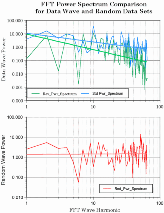
Fourier transform operations were performed on the data
sets shown in Figs. 12 and 13, with the results shown in Fig. 14. The top
graph of Fig. 14 includes plots for the standard and revised
Data Wave power spectra, while the bottom graph displays the Random
Wave power spectrum. The colored lines drawn through each of the spectra
are power function curve-fits, that show the frequency roll-off
characteristics of each wave. Notice that the two power spectra in the
top graph exhibit frequency roll-off (power level decreases with increasing
frequency), whereas the lower graph power spectrum exhibits a flat frequency
response (power level is frequency independent). This frequency roll-off
is characteristic of information carrying signals, whereas the flat response
is characteristic of noise or random signals.
The revised data wave spectrum, shown in the top
graph in green, is exhibiting the nearly perfect ![]() frequency
response that is typical for an information carrying waveform. On the other
hand, the standard data wave power spectrum shown in blue,
exhibits frequency roll-off, but with a flatter response that is not
frequency
response that is typical for an information carrying waveform. On the other
hand, the standard data wave power spectrum shown in blue,
exhibits frequency roll-off, but with a flatter response that is not ![]() .
In fact, the flatter frequency response of the standard data wave
is the likely result of high frequency noise
.
In fact, the flatter frequency response of the standard data wave
is the likely result of high frequency noise
that increases the power at the tail end of the spectrum
and prevents a steeper roll-off. This is something that should be expected
from the distorted standard data wave with imbedded mathematical
errors, which would tend to add randomness to the wave. The signature of
such randomness can be seen in the Random Wave power spectrum, shown
in the lower graph in red. This plot shows the typically flat frequency
response of a random, or noise signal with no information content. Apparently,
the graphs in Fig. 14 are showing that the standard and revised data
waves are definite information carrying waveforms, but that the distorted
standard data wave has imbedded high frequency noise that flattens
its response. This is essentially what Figs. 12 and 13 are showing as well.